Internet Archive · Archive-It · UX Research · 2025
Modernizing web archive discovery for Archive-It
Evaluating search usability in a complex archival system.
RoleUX Designer
ToolsFigma, FigJam, Google Suite
Team5 UX Researchers
TimelineJanuary – May 2025 (15 weeks)
Context
A powerful tool, hidden behind a confusing interface.
Archive-It, a service by the Internet Archive, is a platform where institutions capture and manage web content. Our goal was to improve the search, discovery, and filtering experience for end-users to enhance usability and expand the platform's reach.
Before
After
But first, let me explain the problem
Power comes with complexity.
Archive-It is a powerful web archiving platform used by researchers, archivists, and institutions — but its power comes with complexity. Stakeholders and users reported that the existing interface was unintuitive, with overwhelming search results and confusing information pathways that hindered the research process.
Our challenge was to identify where users got stuck, why those breakdowns occurred, and how the interface could better support users' mental models during search.
Who's affected: Researchers, archivists, and institutional staff managing web collections
Core tension: A system built for power users, but used daily by people with varying levels of archival expertise
What we needed to learn: Where breakdowns happen, why they happen, and what mental model users actually bring to search
We began by mapping the existing site architecture to understand the user's journey.
Method: Conducted a navigation analysis to trace how students and researchers access archived collections.
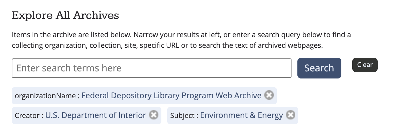
Key insight: The landing page offered too many competing search pathways — multiple bars, carousels, and "explore" tabs — leading to "trial and error" navigation for new users.
Stakeholder and user interviews
We conducted semi-structured, 30–45 minute interviews over Zoom with six key stakeholders. This method allowed us to probe into user motivations while following a standardized protocol for consistency.
Who we interviewed
The Client Team: To understand the platform's vision and identified pain points like metadata display.
Three Archivists: From collecting organizations to learn how they curate and tag content.
Two Scholars: One frequent user and one novice, to capture a range of search behaviors and academic needs.
Findings: Archivists and scholars used different mental models. Scholars relied on specific metadata (e.g., ISSNs, citation totals) that archivists were not consistently providing.
Recommendation: Standardize metadata practices to ensure essential fields like "subject categories" or "keywords" are present across all collections.
Archivist Interview Script
Scholar Interview Script
Survey Research
Quantifying the qualitative patterns.
We deployed surveys to gather quantitative data on user search approaches and feature preferences.
Participants: 2 students, 1 professional researcher, 1 general user.
Method: Conducted a pilot survey followed by a final version to bridge information gaps about the user base.
Finding 1
High demand for search guidance
A majority of users noted they did not know where to start their search or what specific filters did.
Finding 2
Preference for metadata
Users identified "Collection Title" and "Description" as the most critical factors when deciding to explore a collection.
Finding 3
Search over navigation
Quantitative trends showed users preferred using a search bar over manually clicking through organization categories.
Comparative analysis
We benchmarked Archive-It against direct and indirect competitors (e.g., JSTOR, Library of Congress, UK National Archive).
Best practices found: Competitors used collapsible list views instead of large calendar views and placed advanced/regular search options together for better intuition.
Recommendation: Incorporate a single, unified search bar with "Advanced Search" as a dropdown option rather than a separate section.
Heuristic Evaluation
Using Nielsen's 10 Usability Heuristics, we identified critical interface violations.
Severity 3
Consistency & Standards. Help and Documentation was hidden. Help features were not placed near the search bar where users actually needed them.
Severity 3
Error Recovery. When searches failed, the site provided no feedback on why it failed or how to fix it (e.g., "Did you mean?"), leaving users stuck.
Moderate
User Control & Freedom. The site lacked a way to "undo" or easily exit a specific search pathway without using the browser's back button.
Recommendation: Consistently place help resources near the search functionality so users can consult them mid-task.
Usability Testing
Usability testing
Finally, we conducted moderated usability tests with undergraduate and graduate students between the ages of 18–30. Sessions were conducted over Zoom and in person, and participants were asked to complete a series of search and discovery tasks on the Archive-It platform while thinking aloud.
Usability Test Script
Usability Test Notes
Finding 1
Reliance on search
Participants ignored predefined filters almost entirely, relying strictly on the search bar even when it led to poor results.
Finding 2
Error fragility
Small spelling errors completely broke the search experience because the system lacked "fuzzy search" or autocorrect capabilities.
Finding 3
Navigation disorientation
Even experienced archival users "lost track" of the search bar when changing tabs, indicating a need for a more persistent and intuitive header.
Synthesis
The recommendations
Search interface & navigation
Consolidate search bars: Replace the existing multiple search bars with a single, unified search bar labeled "Search the Archive" to reduce user confusion between standard and advanced searches.
Integrated advanced search: Transition "Advanced Search" from a standalone section to a drop-down menu within the primary search bar, allowing advanced users to refine queries without cluttering the interface for novices.
Metadata & filtering
Standardize metadata practices: Define a mandatory set of system-required metadata fields (such as subject categories or keywords) for archivists to ensure consistency and improve cross-collection searchability.
Prioritize key identifiers: Increase the visual prominence of high-value metadata, such as "capture dates," which users reported as critical for sifting through high-volume results.
Collapsible filters: Redesign filters into collapsible list views to reduce cognitive load and the time users spend reading through long lists.
User support & error management
Dedicated "how-to" page: Create a separate, easily accessible page providing guidance on how to navigate the specific complexities of web archives.
Contextual help visibility: Relocate the "Help with Search" resources to be consistently visible and near the search functionality so users can consult them mid-task.
Enhanced error feedback: Improve system feedback when a search fails by clarifying why the error occurred and providing actionable steps for the user to recover.
Technical design improvements
Navigation landmarks: Ensure the search bar and navigation elements remain persistent or easily locatable even when users are changing tabs or drilling deep into collections to prevent disorientation.
Undo functionality: Provide clear options for users to "undo" actions or exit specific search pathways without relying solely on the browser's back button.
Happy to say they were implemented!
More collapsible filters
One singular search bar, navigation landmarks, undo functionalities on filters
Dedicated how-to page
Reflection
Learnings
Through the triangulation of heuristic evaluation and usability testing, I learned that even expert users (archivists) become novices when a system's search logic is opaque. We found that users weren't failing because of a lack of skill, but because the system provided no feedback on "why" a search failed or how to recover from error.
This project taught me that for specialized tools, my role as a designer is to act as a translator, bridging the gap between a dense back-end database and a user's mental model by providing consistent, visible guidance at the moment of need.
Next steps
I would then conduct A/B testing between the original interface and the new prototype. My success metrics would be a reduction in "Task Completion Time" and a decrease in "Error Recovery Time."
Simultaneously, I would recommend a Metadata Workshop with the client to create a standardized data-entry template for archivists, ensuring that the new "filters" we proposed actually have high-quality data to display.