Case Study · Product Design

Spotter

Designing a dual-platform mobile and wearable experience that helps personal trainers capture session data in real time, without losing the human connection that keeps clients coming back.

Role Lead UX Designer
Team 5 Designers
Timeline 12 Weeks
Tools Figma · Maze · Dovetail

Chapter One

The trainers were stuck between two impossible things.

Personal trainers who manage four or more active clients constantly face the same impossible choice: look at their phone and log data accurately, or stay present and actually coach.

Most existing tools were built for planning and post-session review, not for the floor. So trainers delayed their notes, relied on memory after long days, and watched the accuracy of their data quietly erode.

The Numbers

A problem hiding in plain sight.

4+ Avg. clients managed simultaneously
73% Trainers reported logging after sessions from memory
5+ Disconnected tools used to track a single client

Chapter Two

We listened before we designed anything.

We ran semi-structured interviews with personal trainers spanning 1 to 13 years of experience — different coaching styles, different client mixes, different definitions of "the floor."

The goal was to understand how documentation happens today, what breaks during live sessions, and how trainers decide what is worth tracking.

01

Empathize

  • User Interviews
  • Secondary Research
  • Competitive Analysis

02

Define

  • Affinity Mapping
  • Key Insights
  • User Persona

03

Ideate

  • User Journey Map
  • User Flow
  • Information Architecture

What we found

Three patterns kept surfacing.

Finding 01

Live session logging competes directly with coaching presence

Trainers prioritized eye contact and real-time cues, so they avoided any tool that required tapping, typing, or reading mid-set.

Finding 02

Memory-based recall increases cognitive load and reduces accuracy

When logging happened later, details faded quickly across a day, which led to incomplete or incorrect records and weaker programming decisions.

Finding 03

Trainers sit on a spectrum of data needs

Some wanted minimal tracking while others needed depth, reinforcing the need for progressive disclosure across the experience.

Survey insights

The data confirmed what the interviews hinted at.

Insight 01

Progress visibility drives consistency

Trainees had higher consistency when effort felt seen and tracked — even lightweight progress views made a measurable difference in follow-through.

Insight 02

Too much data creates anxiety

Data overload triggered confusion rather than clarity — a direct validation of our progressive disclosure approach. Show the minimum useful view first; let users pull for more.

Insight 03

Tool fragmentation is a daily tax

Trainers bounced between calendars, notes, spreadsheets, and messaging apps every single day — a hidden cost that fragmented both their attention and their data.

Chapter Two · Continued

We sketched before we built anything.

With research in hand, we moved into rapid ideation. Sketching let us explore structure. Wrong ideas were easy to throw out when they were still on paper.

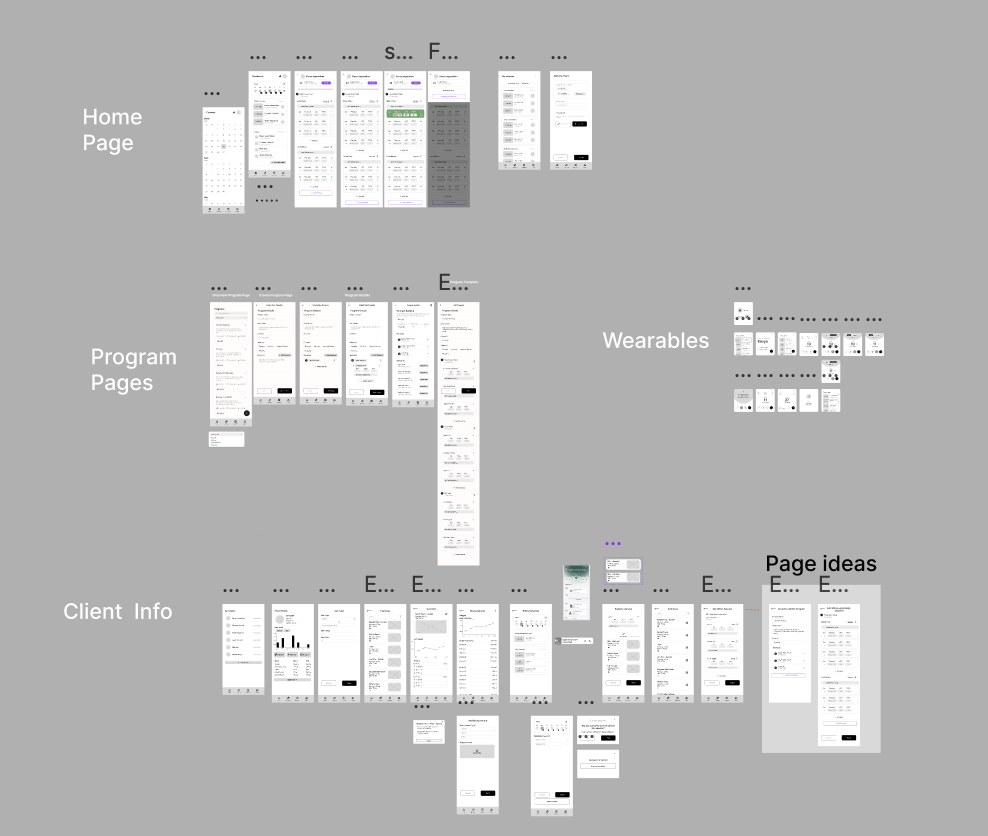
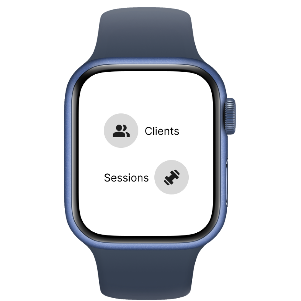
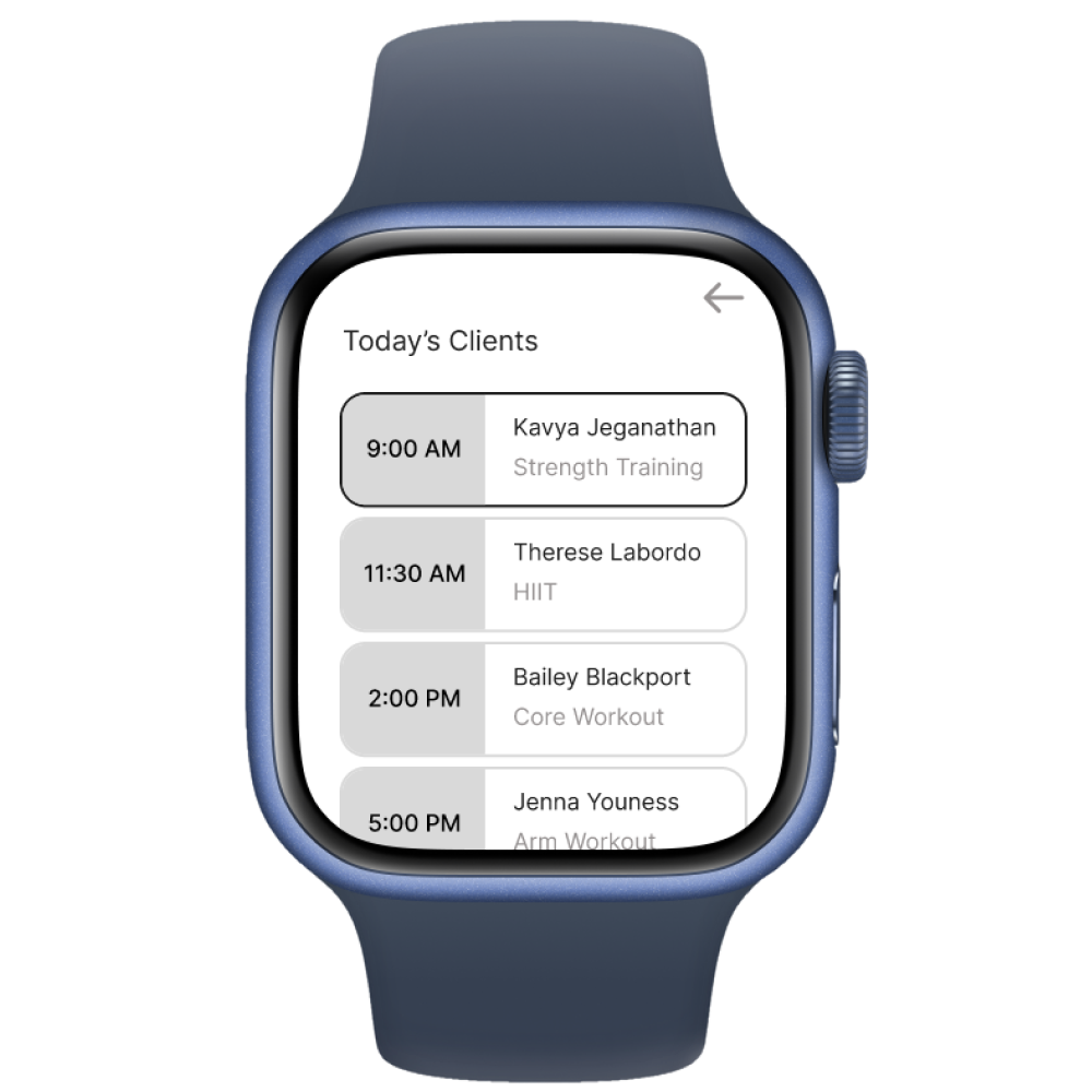
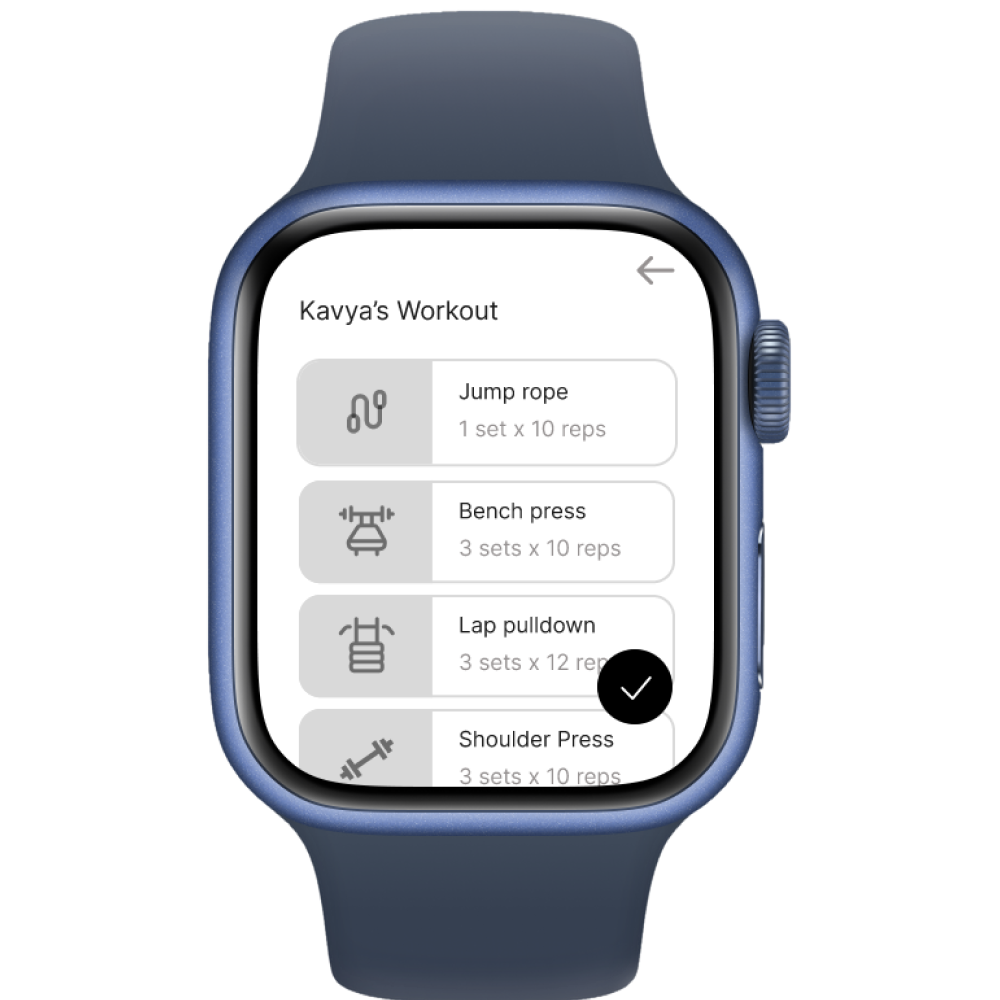
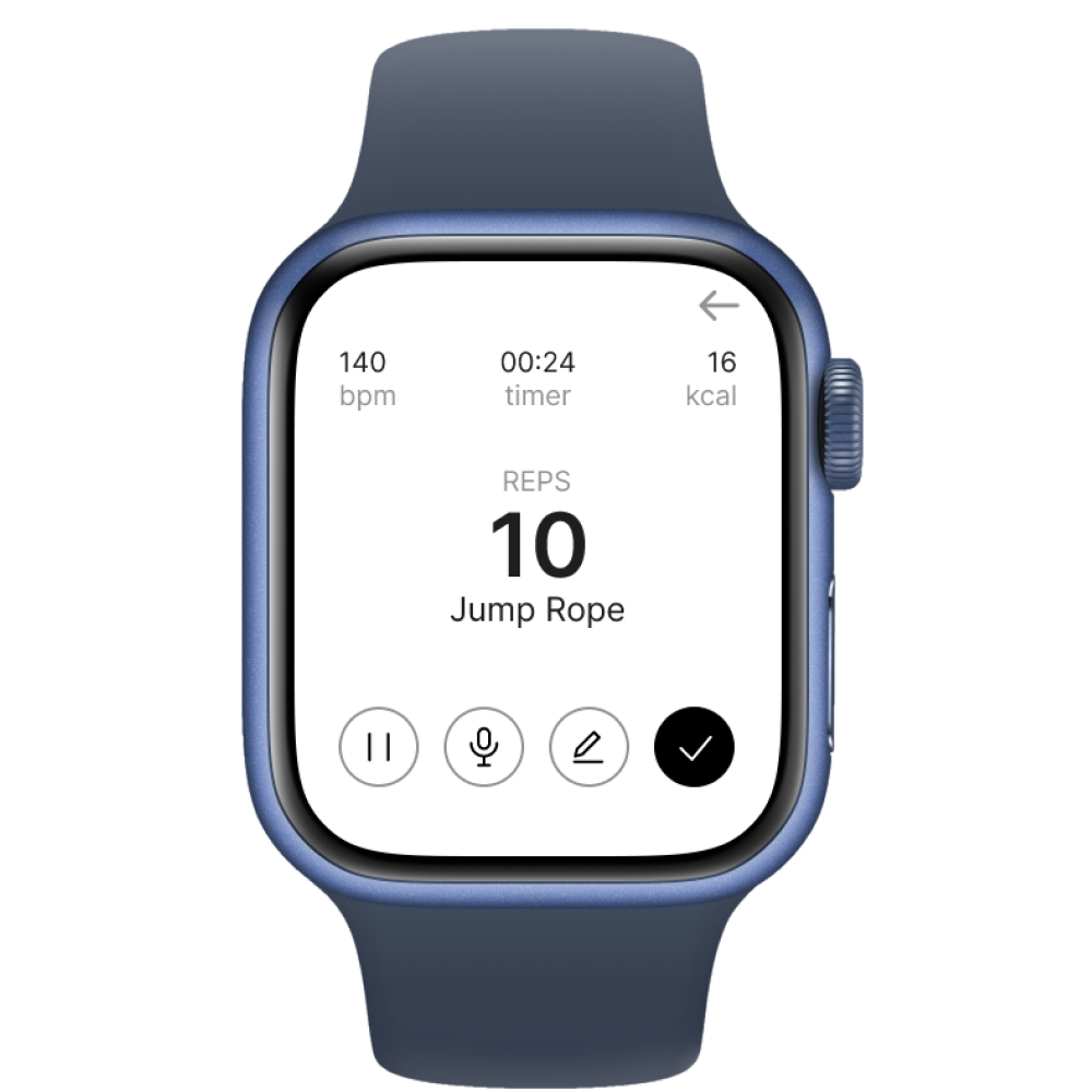
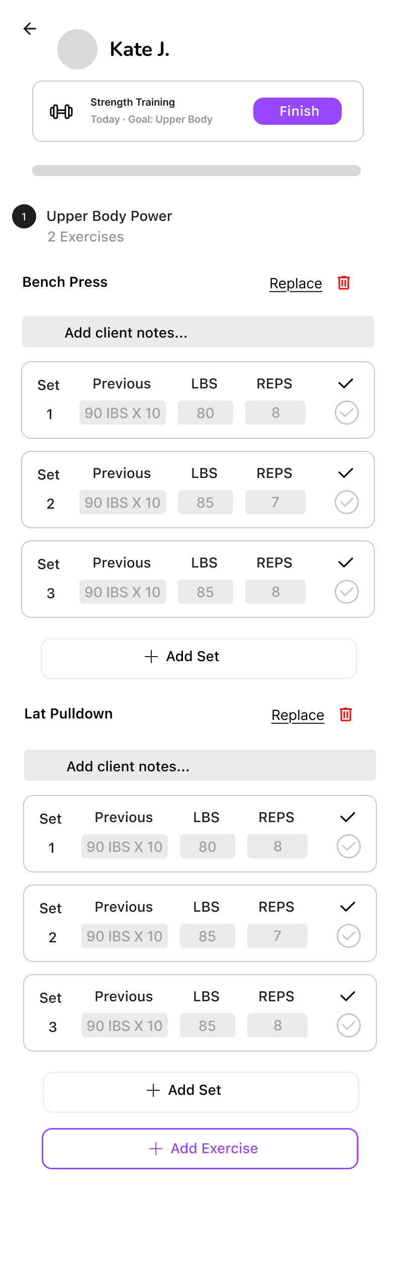
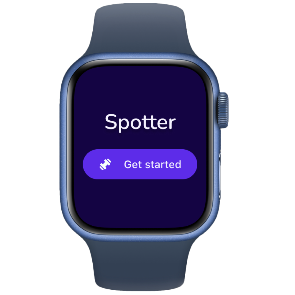
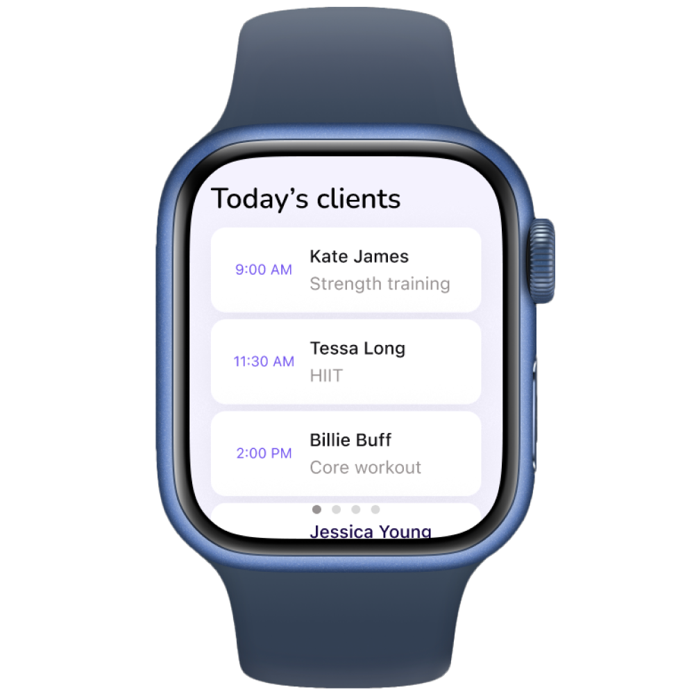
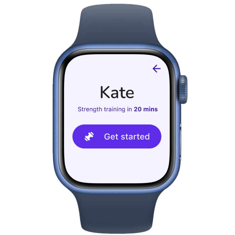
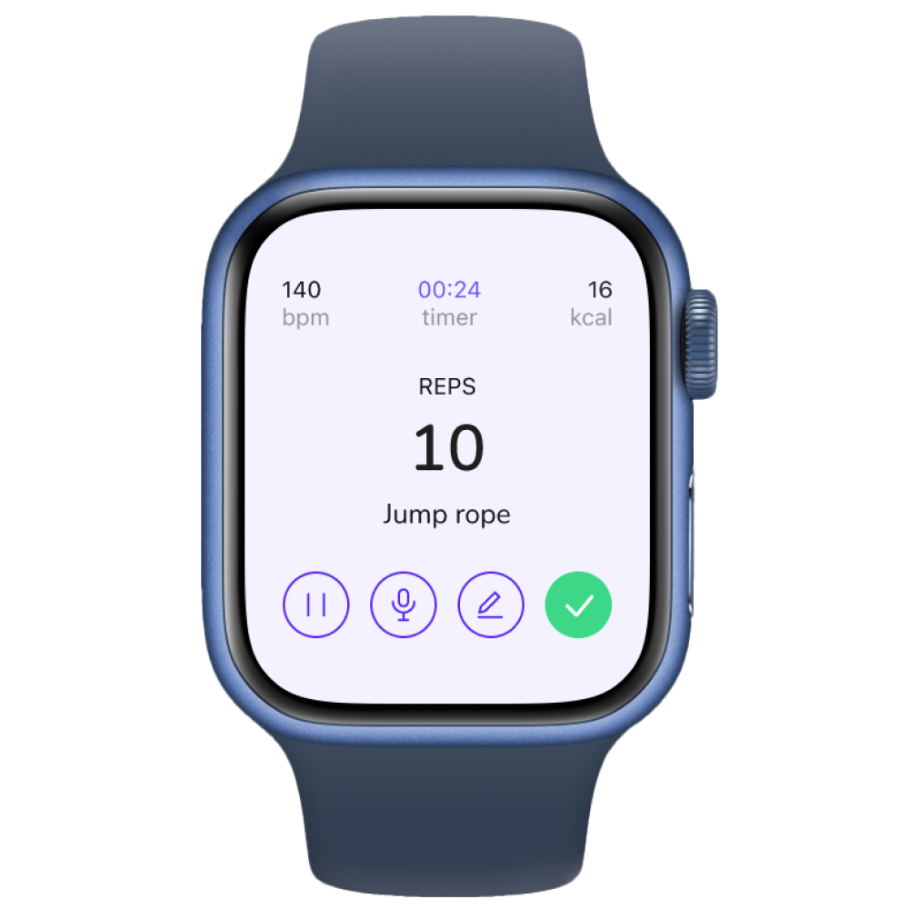
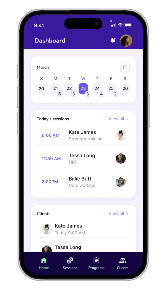
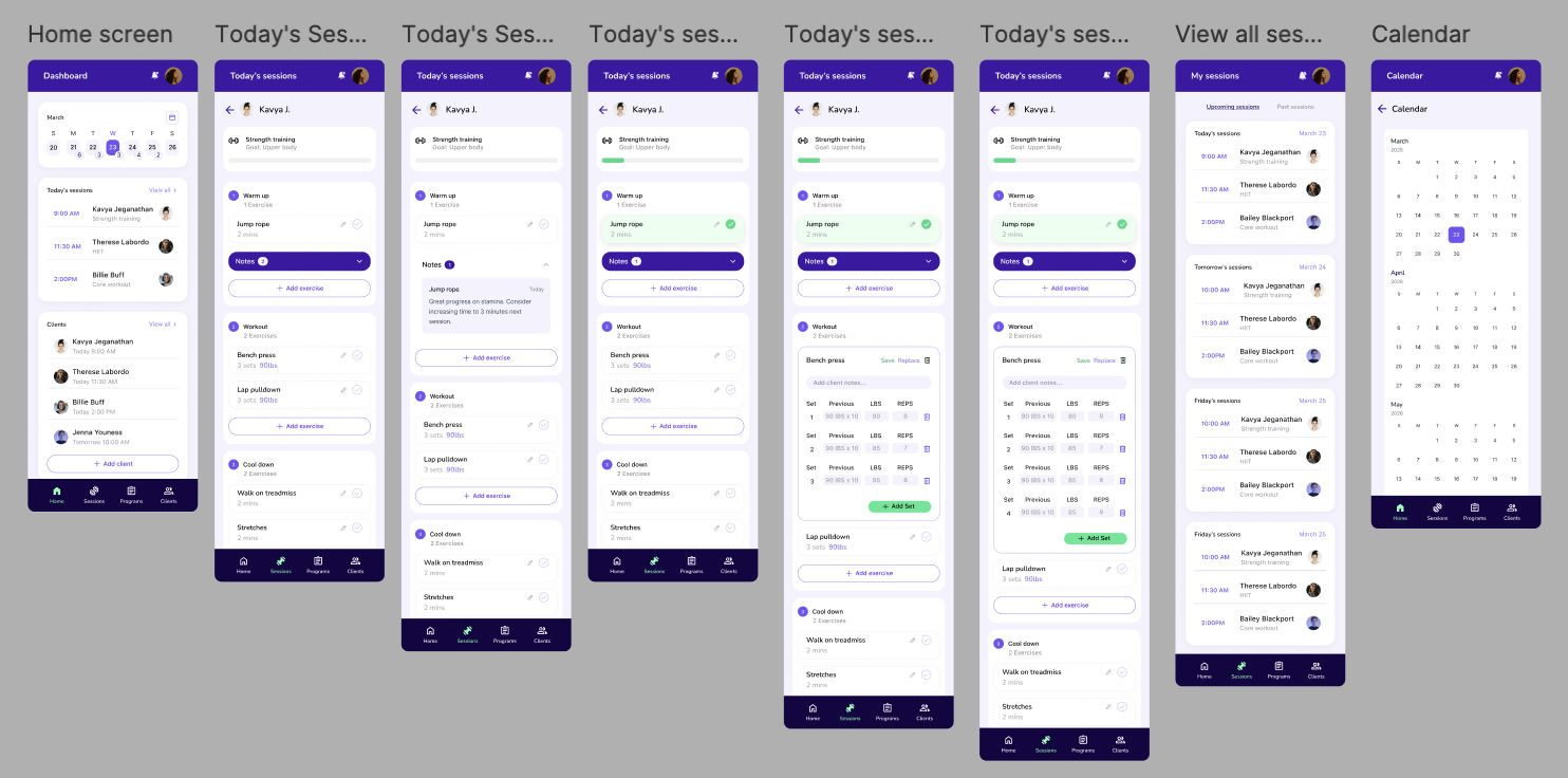
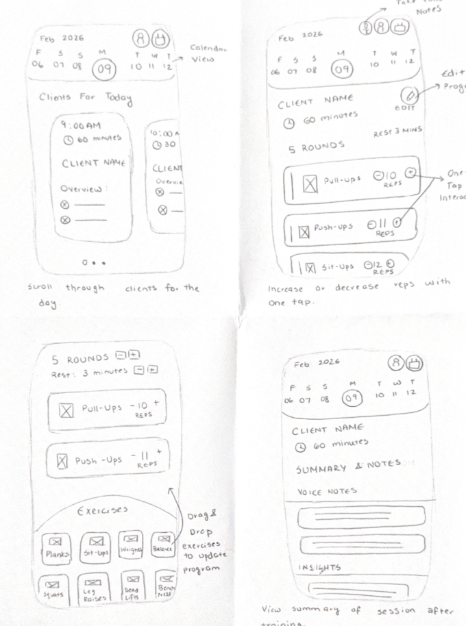
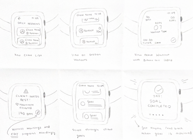
We focused on two interaction models: a minimal wearable flow for the floor, and a deeper mobile hub for planning and review. Several sketch directions were explored before converging on the approach that best balanced speed with depth.

Spotter sketch
Spotter sketch 1
Spotter sketch 2
Spotter sketch 3
Spotter sketch 4

Wireframes

Structure first, style later!

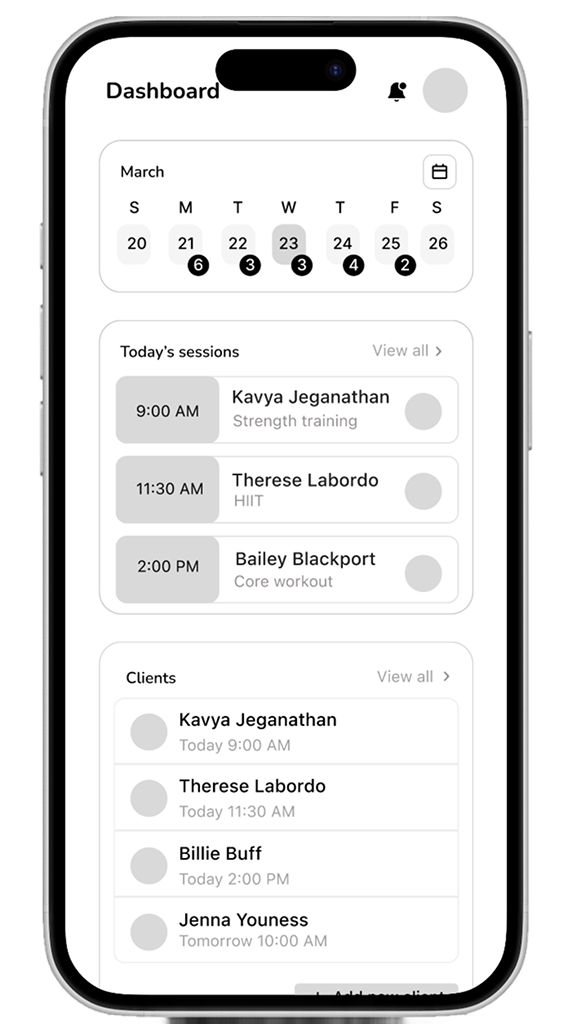
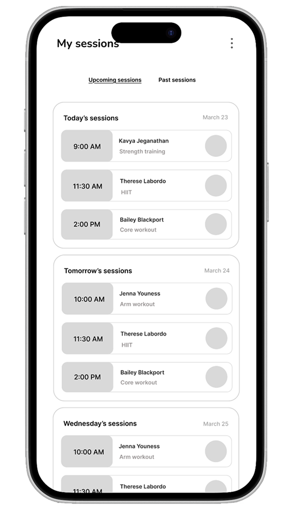
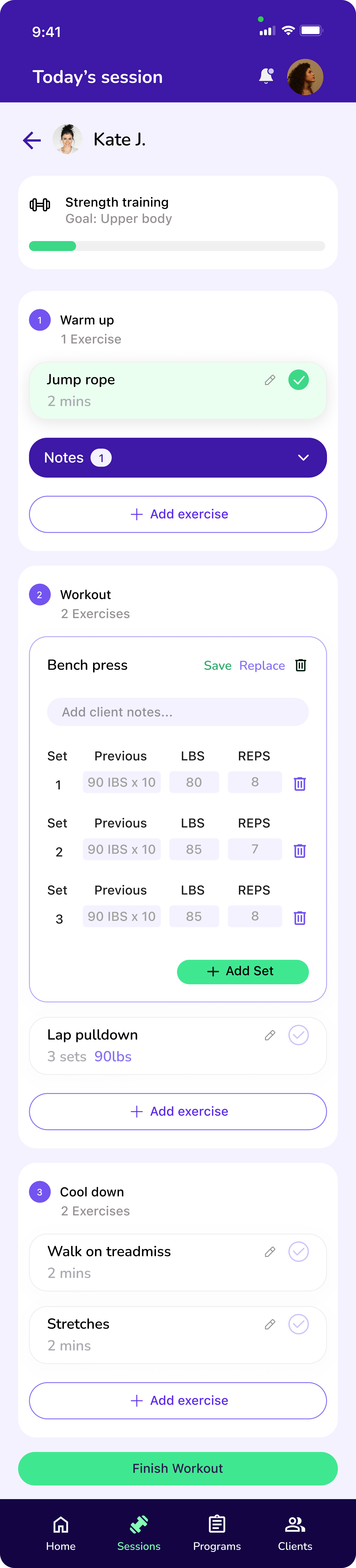
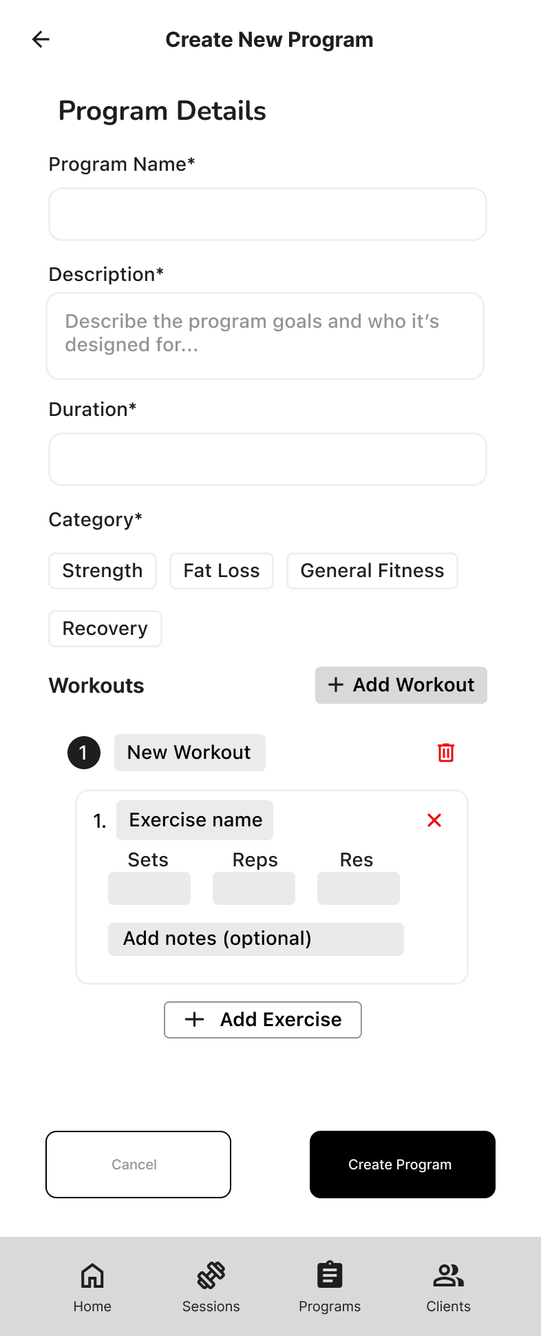
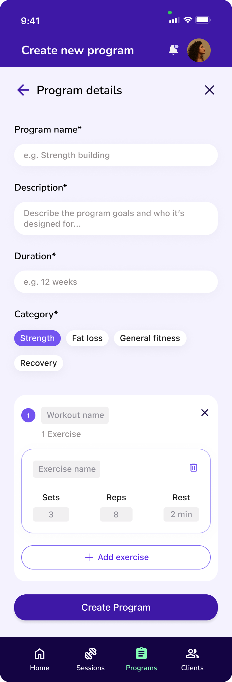
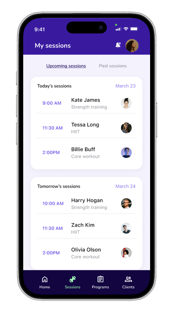
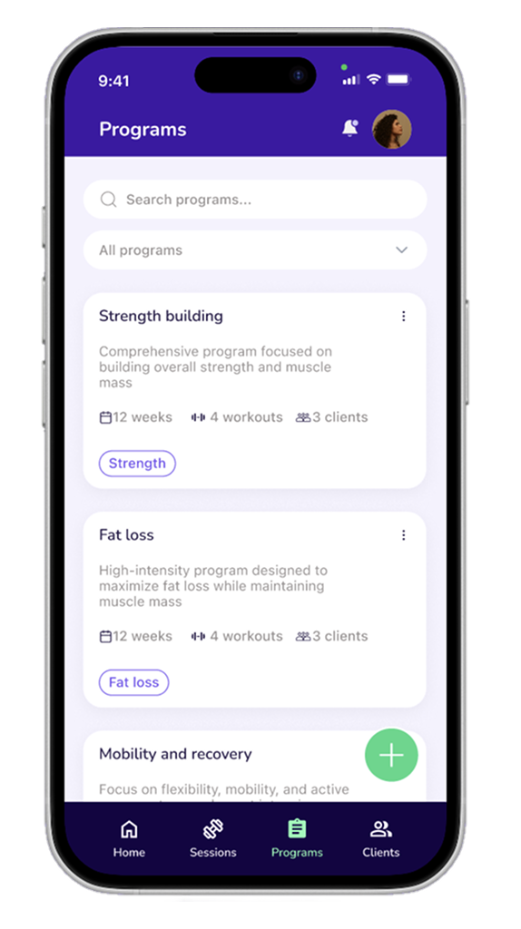
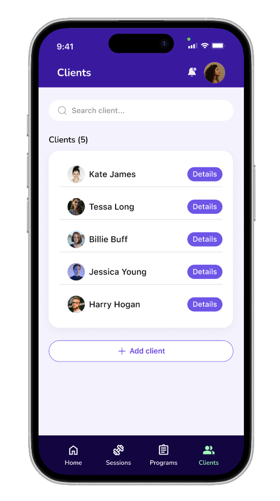
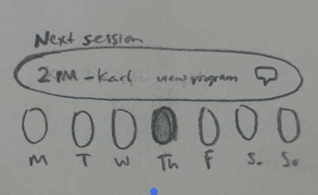
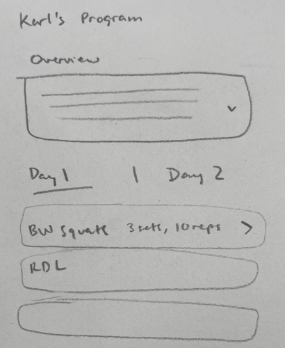
We translated the strongest sketch directions into low fidelity wireframes — a 26 screen mobile prototype and a 15 screen wearable prototype. The wireframes helped us validate structure first, without the distraction of color or typography.

From there, we ran moderated think-aloud tests with five participants using the low fidelity prototypes across both mobile and wearable. Their feedback shaped the navigation structure, the labeling, and the density of information shown at each step.

All wireframes
Mobile wireframe 1
Mobile wireframe 2
Wearable wireframe 1
Wearable wireframe 2
Wearable wireframe 3
Wearable wireframe 4

Usability testing

We tested before we polished anything.

We conducted moderated think-aloud tests with five participants using low fidelity prototypes across both mobile and wearable. Participants completed tasks like accessing daily sessions, editing client information, customizing programs, and logging actions on the wearable during a simulated training moment. The biggest issues centered on navigation consistency, unclear affordances on cards, and confusion between similar actions. We addressed these through clearer labels, stronger visual cues, and more consistent paths.

Problem 01

Card affordances were unclear, making users unsure what was tappable.

Several participants hovered or hesitated on cards before tapping, unsure whether they were interactive or just informational.

Today's session wireframe

Solution 01

We added stronger visual cues — chevrons, tap states, and consistent card elevation.

Interactive cards now carry a clear visual signal: a chevron, a subtle shadow, and a pressed state that confirms the tap registered.

Today's session edit

Problem 02

Users creating a new program couldn't easily find how to add a workout.

The "Add Workout" action was buried in an empty state with instructional copy rather than surfaced as a clear button, so the path forward wasn't obvious.

Create new program wireframe

Solution 02

Surfaced "Add Workout" as a prominent button and pre-populated the section so the path was immediately clear.

The action moved from buried instructional copy to a visible button alongside the Workouts label. A pre-populated workout item showed users exactly what adding one would produce — no guessing required.

Create new program final

Chapter Three

A connected system

We designed Spotter as a mobile hub + low-attention wearable pairing. On the floor, trainers tap the watch to mark sets, adjust loads, and capture quick voice notes without breaking eye contact.

Off the floor, the mobile app organizes programs, sessions, and client history. A post-session summary reinforces trainee accountability and surfaces patterns over time.

Color palette

Our color palette

Team color ideation

Fun team color ideation!

The wearable

Designed for quick glances

The wearable interface strips the experience down to its essentials. One tap to log, one tap to move on. Large tap targets, minimal text, voice fallback for everything that needs more detail.

Spotter splash screen on Apple Watch

01 — Launch

Today's clients list on Apple Watch

02 — Today's clients

Client pre-session screen on Apple Watch

03 — Pre-session

Live rep tracking on Apple Watch

04 — Live logging

The mobile app

The hub that holds everything together.

While the wearable handles the moment, the mobile app handles everything around it — client profiles, session programs, historical trends, and post-session summaries that write themselves.

Mobile — home
Mobile — session view
Mobile — client profile
Mobile — summary

My contribution

I led the Home and Session flows end to end.

I took the Home and Session flows from initial wireframes through final implementation. I was also a key contributor to the final visual design system, helping design all mobile screens and wearable interfaces to create a cohesive cross-device experience.

Home and session screens

Mobile prototype

Try the mobile experience.

Navigate the full mobile flow from home to session to post-session summary.

Wearable prototype

Try the wearable experience.

Click through the Apple Watch flow: log sets, move between clients, capture notes.

Reflection

What I'd carry forward.

Designing for trainers means designing for attention. The product succeeds only if it protects presence during the session — you can't just make something fast, you have to make something that doesn't ask for attention at the wrong moment.

Progressive disclosure works best when it starts from a clear definition of minimum useful data — not from a list of possible metrics. That framing changed how I think about every feature prioritization decision.

Navigation clarity depends on naming and structure. Small mismatches in labels can create big confusion when actions look similar.

What's next

  • Validate Spotter in real gym environments with working trainers and live clients.

  • Refine wearable interactions for faster use, like haptic patterns, clearer data entry labels.

  • Explore integrations with calendars, messaging platforms, and fitness data services.

Next case study

Workiva — Content Design

Read next →
Expand