Workiva · Content Design · 2023

The product was strong. The words weren't.

Building a scalable content system for a beta mobile app in a regulated environment.

Role Lead Content Designer
Tools Figma, Zendesk
Team Director of PM, 2 Engineers
Timeline January – May 2023

Chapter One

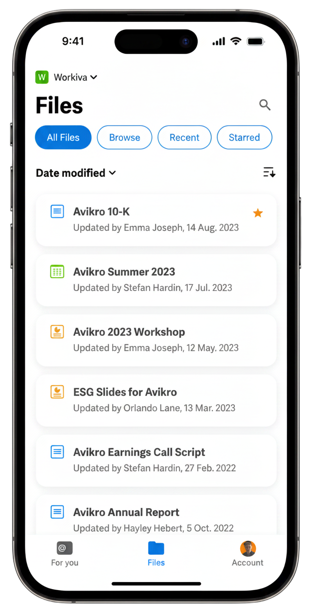
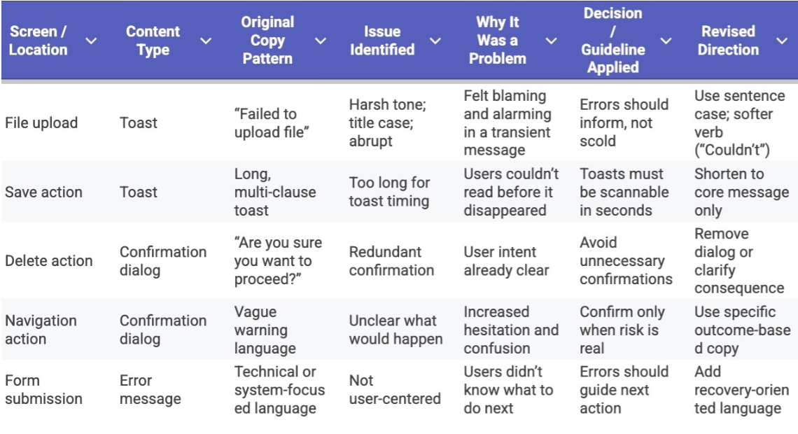
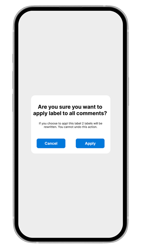
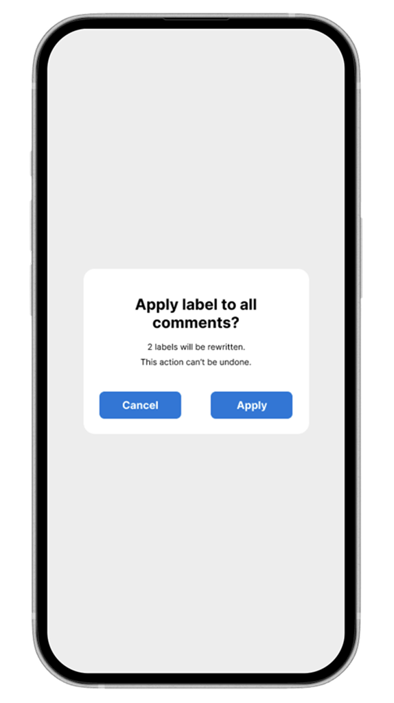
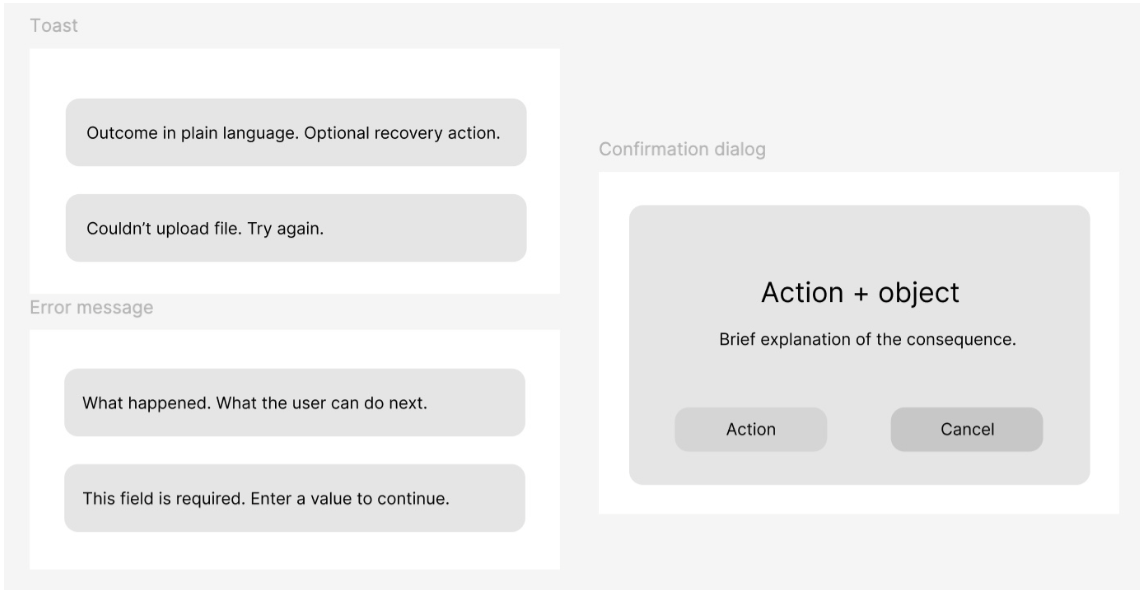
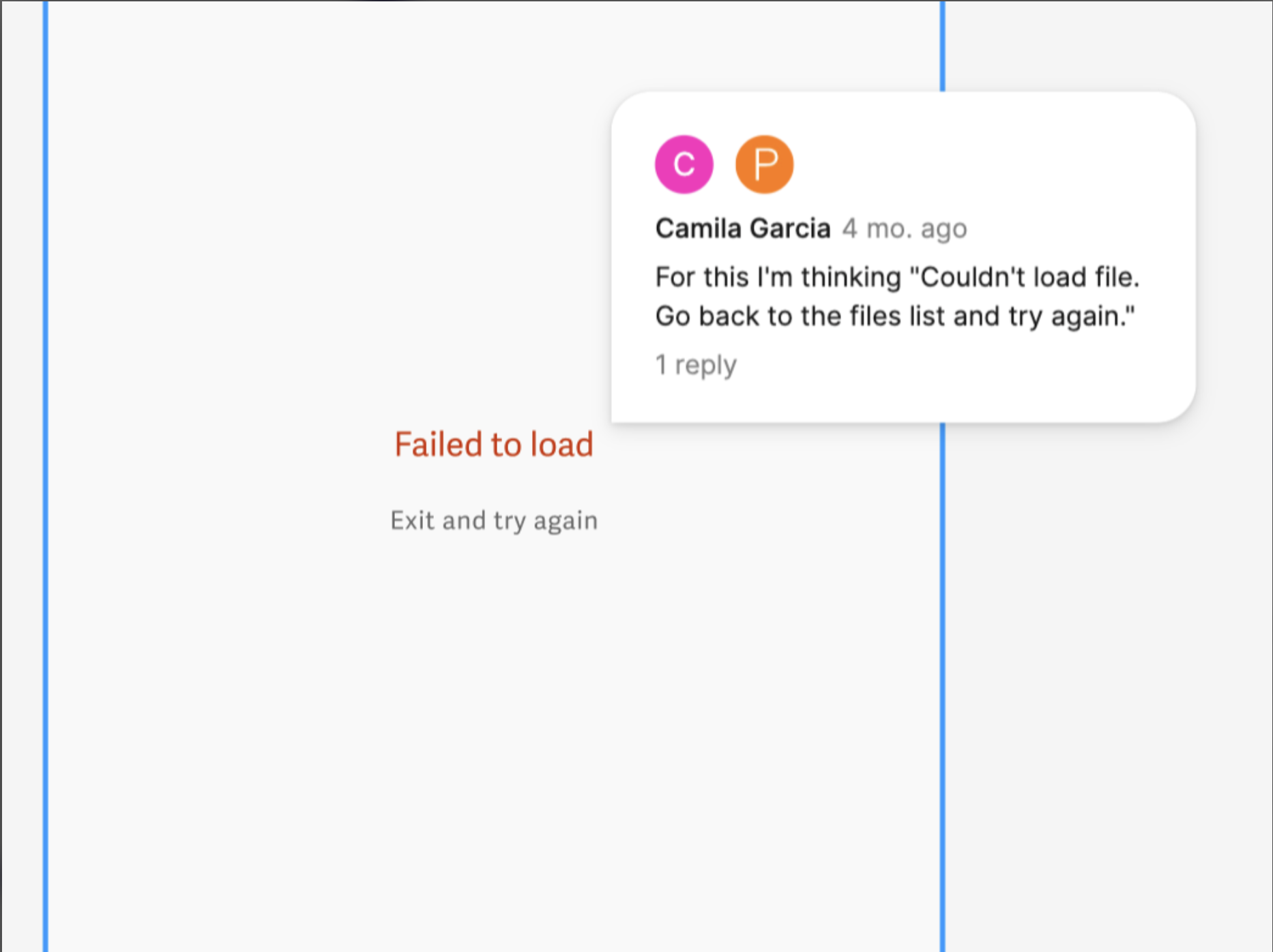
When the app launched, the functionality was solid — but the voice wasn't.

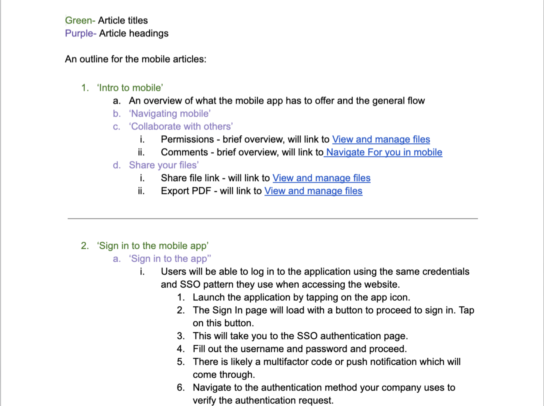
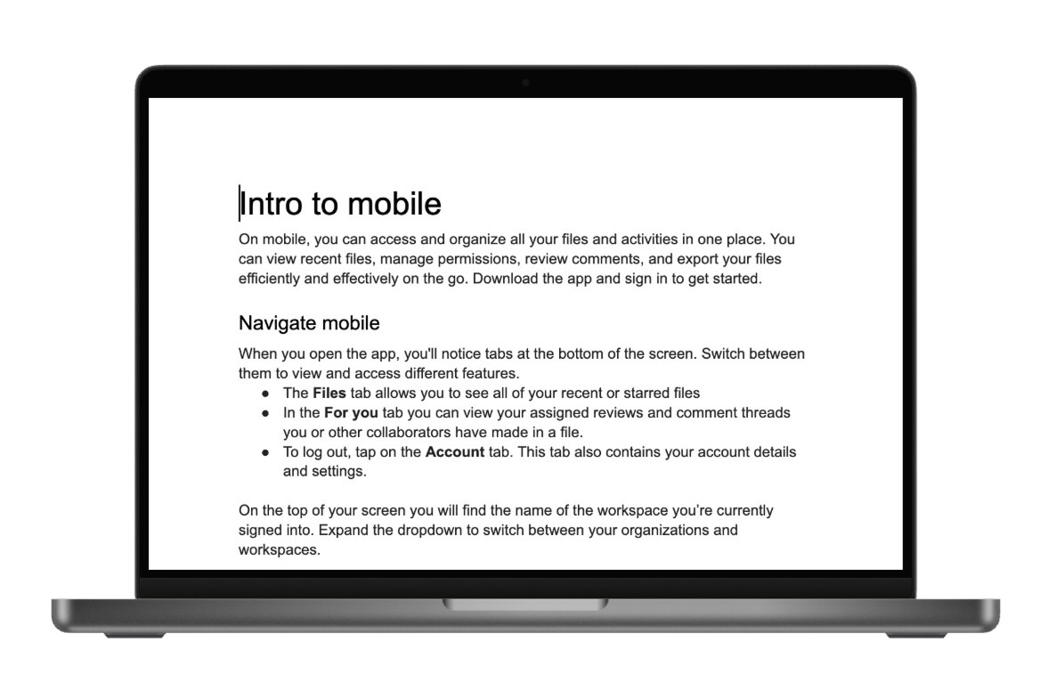
As a Content Design Intern at Workiva, I took ownership of building a scalable content system that would unify the app's voice across mobile and documentation — before inconsistencies compounded at scale.

The product needed to feel trustworthy in a regulated financial environment. That meant every word had to earn its place.

Workiva mobile app

The Problem

The app lacked a unified voice.

Across similar flows, users encountered inconsistent writing that eroded confidence in the product:

  • Multiple casing styles across the same screen types
  • Alarmist error language that created unnecessary anxiety
  • Redundant confirmation prompts that slowed users down
  • Tone inconsistencies between web and mobile

Individually, these were small inconsistencies. Collectively, they slowed comprehension, reduced perceived polish, complicated localization, and undermined trust in a regulated product.

The product was strong. The content wasn't reinforcing that strength.

Impact of inconsistency

Slowed comprehension across flows

Reduced perceived polish of the product

Complicated future localization efforts

Undermined trust in a regulated environment

So, I took charge of building a system that would bring the experience into alignment.

The Process

The product needed a system — not just edits.

The issue wasn't sentence quality. It was structural inconsistency. To scale effectively, the app needed a content system that felt:

01

Clear

No ambiguity. Every message should tell the user exactly what happened and what to do next.

02

Consistent

Predictable patterns across flows, so users never have to re-learn the product's language.

03

Human

Informative, not alarming. Errors should feel like guidance, not system failures.

04

Scalable

Ready for localization, growth, and a team that changes over time.

The Audit

To understand the scope, I mapped the entire mobile content ecosystem.

I began by auditing every piece of user-facing content across the mobile app — including buttons, toasts, error states, confirmation dialogs, and empty states.

I catalogued inconsistencies in casing, tone, length, and intent — noting where content felt unclear, redundant, or unnecessarily alarming.

The audit made one thing clear: this wasn't a copy problem. It was a systems problem.

I defined a small set of content principles to guide decisions across the app. These principles became a lightweight content system that made future decisions faster and more consistent.

Workiva mobile content audit

The Copy

UI copy that actually makes sense together.

Goodbye Title Case Everywhere. Hello sentence case and readable, consistent patterns. This boosted readability, improved accessibility, and made future localization less painful.

Toast messages that don't panic the user

One of my favorite fixes: replacing the word "Failed" with "Couldn't", because no one deserves to be yelled at by a toast. I also shortened each message so it could be understood in the tiny window of time it appears.

Before

"Failed to upload file"

Harsh, alarming, no recovery path

After

"Couldn't upload file. Try again."

Calm, informative, action-oriented

Confirmation dialogs with less "Are You Sure??" energy

I trimmed them down, removed polite-but-unnecessary fear-mongering, and made the actions the star of the show.

Before — confirmation dialog
After — confirmation dialog

Templates

I even made a template.

Once the content system was defined, I wanted to make sure it could actually outlive me. So I built a set of reusable copy templates to make onboarding new content designers as frictionless as possible.

The templates covered common patterns — error messages, confirmation dialogs, empty states, and toast notifications — giving anyone joining the team a ready-made starting point that already aligned with our voice and guidelines.

The goal was simple: a consistent voice shouldn't depend on institutional memory. It should be baked into the tools.

Workiva content design template

Collaboration

A system is only useful if it survives reality.

I partnered closely with the Product Manager and engineers to review proposed changes in context, ensuring the copy matched real system behavior and technical constraints.

Feedback often surfaced edge cases — timing, truncation, platform-specific behavior — which helped refine messages so they worked in production, not just in mockups.

Workiva collaboration and Zendesk process

Chapter Two

I scaled beyond the UI.

Once core UI patterns were established, I extended the same principles to mobile help documentation — ensuring users received the same voice whether tapping through the app or searching for help.

↓ The documentation

The Documentation

With the UI aligned, the next question was: would the voice hold outside the app?

I built a complete library of mobile-specific help articles grounded in the same principles:

  • Clear introductions
  • Action-driven headings
  • Short, scannable steps
  • Bolded button labels
  • Consistent structural templates

This ensured users encountered the same voice whether tapping through the app or searching for help.

Workiva document outline

Document Drafts

With the system in place, individual messages became sharper.

Content design isn't just about refining words. It's about building structures that support confident user decisions.

"

She readily took on the mobile app project and actively seeks out feedback on in-app copy from the team. When she had to create a series of new help articles on her own, she learned organizational strategies from others and applied those learnings to her own work, which shows that she is open to trying different processes to figure out what works best for her.

Sarah Kang · Workiva

Reflection

What I'd carry forward.

Working on a beta product reinforced the importance of establishing systems early — before scale amplifies inconsistency. What began as scattered tone differences revealed a structural gap.

By addressing it holistically, I helped create alignment across UI and documentation. In regulated environments especially, clarity builds trust.

Content design is systems design. Every word decision is a design decision — and the best ones hold up at scale.

What's next

  • Extend the content system into onboarding and empty states.

  • Build a living style guide to maintain consistency as the team grows.

  • Test localization readiness across the revised copy patterns.

Next case study

Spotter — UX Design

Read next →
Expand